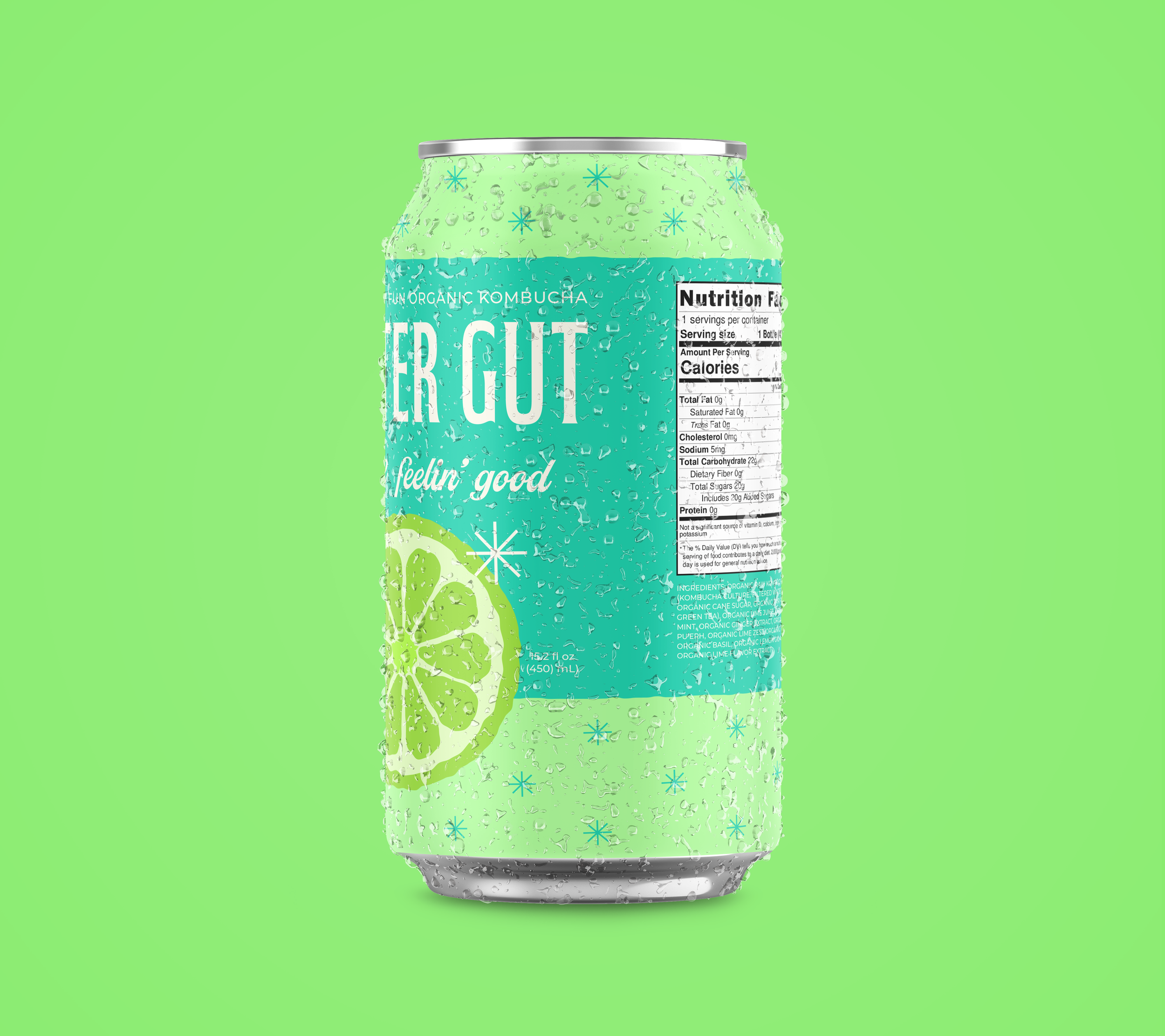
Glitter Gut Kombucha
Logo, branding, packaging, and social media campaign
The Challenge
This concept kombucha brand brings the fun and joy often associated with junk food to the wellness and health space.
Background: Glitter Gut customers are generally health-focused adults aged 25-55, but there’s a secondary audience of young adults 18-34 who crave fun beverages but do not consume alcohol.
My Approach
Almost all branding in the health and wellness space takes itself very seriously – think Nike, Lululemon, Whole Foods, etc. So, why can’t a healthy brand do what sugary cereals and candy do – employ bright colors and cartoony imagery to inject their brands with joy and happiness?
Further, I leaned on my copywriting background to give this brand extra punch by employing punny names and comical social media posts.
Analysis and Moodboards
I set out to find brands that used bright colors successfully, as well as brands that brought a sense of playfulness to their packaging and ads. I gathered images, browsing internet sources, magazines, and my local grocery store shelves. I noticed many cases where a combination of clever copy, vivid colors, and cartoon imagery worked together to create a fun brand. I created moodboards to collect my findings.
Sketches
I wanted to use bright colors and illustration to convey a sense of fun in the brand, but I also wanted the look to be modern and polished. I started playing with asymmetry and puns as ways to bring humor to the brand.
Initial Digital Drafts
My ideas evolved with each iteration. At first I considered a flat, modern approach to illustrating the fruit, but this felt too serious. I opted to use a style that used a cross-section with imperfectly “cut-out” shapes to add movement and visual interest. Finally, I found that sans-serif typefaces felt wrong. Though legible, they were also too serious. I chose a script style typeface that felt both fun and polished.
Second Digital Draft
I presented the following digital draft for feedback and heard that there was an opportunity to make it clearer to the audience that this is a kombucha drink. The spacing between elements also felt a bit crowded.
Final Label Designs
I made some final adjustments after receiving feedback. I decided to move the tagline, “get glitter everywhere,” to the back of the can so I could use the front to make the logo and flavor stand out. I also decided that having the script typeface curve around the fruit made it too difficult to read. Finally, I decided to assign each flavor a unique color palette for both the star pattern and can.


Social Media and Marketing
As a modern brand looking to appeal to young adults, I knew that Glitter Gut would need a strong social media presence. They would lean hard on their signature bright colors and love for puns in social media ads, web ads, and billboards.
Reflection
This was a fun project! I learned how to work in Illustrator more efficiently and I used Adobe Dimension for the first time to mock up glass bottles. While I ultimately decided to use cans instead, I’m glad I learned. In the future, I’d love to have both bottle and can versions, and also create additional marketing touchpoints like billboards and other OOH materials.

